When Pushed: Difference between revisions
No edit summary |
(add tooltip text) |
||
| Line 4: | Line 4: | ||
<!--T:1--> | <!--T:1--> | ||
[[Category:Interface]] | [[Category:Interface]] | ||
<section begin="image"/>[[File:When Pushed Block.png|alt=The when pushed block|thumb]]<section end="image"/> | <section begin="image"/>[[File:When Pushed Block.png|alt=The when pushed block|thumb]]<section end="image"/><p id="tooltip">Executes commands inside this block (once, from top to bottom) when the push button widget is pushed. Widgets can be created using the Edit Widgets feature.</p> | ||
<section begin="name" />{{Block|when [▼] pushed}}<section end="name" /> is a code block from the [[Interface]] drawer. | <section begin="name" />{{Block|when [▼] pushed}}<section end="name" /> is a code block from the [[Interface]] drawer. | ||
<!--T:2--> | <!--T:2--> | ||
==Usage== | ==Usage== | ||
{{Block|when [▼] pushed}} begins a single execution of a [[stack]] of code (from top to bottom) when the pushed button [[widget]] is pushed. Widgets can be created using the [[Edit Widgets]] feature. | |||
<!--T:3--> | <!--T:3--> | ||
Revision as of 15:00, 8 August 2023
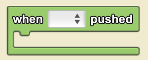
Executes commands inside this block (once, from top to bottom) when the push button widget is pushed. Widgets can be created using the Edit Widgets feature.
when [▼] pushed is a code block from the Interface drawer.
Usage
when [▼] pushed begins a single execution of a stack of code (from top to bottom) when the pushed button widget is pushed. Widgets can be created using the Edit Widgets feature.
Syntax
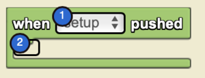
Input:
- Select the desired push-button widget from the drop down menu.

