Add Data To Line Graph/en: Difference between revisions
(Updating to match new version of source page) |
(Updating to match new version of source page) |
||
| Line 14: | Line 14: | ||
<!-- <code>Add data to line graph [Dropdown: Line Graph Widget] for [Dropdown: Data Series] x-axis: [Textbox: x function] y-axis: [Textbox: y function]</code> --> | <!-- <code>Add data to line graph [Dropdown: Line Graph Widget] for [Dropdown: Data Series] x-axis: [Textbox: x function] y-axis: [Textbox: y function]</code> --> | ||
Inputs: | Inputs: | ||
#a graph from the | #a graph from the dropdown menu | ||
#a data series from the dropdown menu | |||
#a number, this will serve as the x function along the graph | |||
#a number, this will serve as the y function along the graph | |||
==Example== | |||
[[File:add_data_to_line_graph_example.gif|alt=Add Data To Line Graph example gif|thumb]] | |||
[[File:add_data_to_line_graph_example.png|alt=Add Data To Line Graph example code|thumb]] | |||
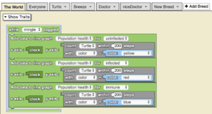
When the ‘mingle’ button is toggled, data is added to the ‘Population health’ line graph for the ‘uninfected’ (yellow sphere) population. As time goes on, data is added to the line graph for each population of the agents. This model has a high immunity rate because as the [[Special:MyLanguage/Clock|clock]] increases, uninfected members become immune. | |||
==Nuances== | ==Nuances== | ||
Latest revision as of 14:44, 14 August 2023
Adds data to a selected series of a selected graph that’s made up of pairs of x-coordinates and y-coordinates. First create a line graph widget using the Widget Editor and add one or more series as needed.
Add data to line graph [▼] for [▼] x-axis: [_] y-axis: [_] is a code block from the Interface drawer.
Usage
Add data to line graph [▼] for [▼] x-axis: [_] y-axis: [_] adds data to a selected series of a selected graph that’s made up of pairs of x-coordinates and y-coordinates. First create a line graph widget using the Widget Editor, and add one or more series as needed.
Syntax
Inputs:
- a graph from the dropdown menu
- a data series from the dropdown menu
- a number, this will serve as the x function along the graph
- a number, this will serve as the y function along the graph
Example
When the ‘mingle’ button is toggled, data is added to the ‘Population health’ line graph for the ‘uninfected’ (yellow sphere) population. As time goes on, data is added to the line graph for each population of the agents. This model has a high immunity rate because as the clock increases, uninfected members become immune.
Nuances
You can add many different line graphs to your simulation, and they can all use the same axes! Just be sure to use different sets of data for each line graph.


