When Pushed: Difference between revisions
No edit summary |
(Marked this version for translation) |
||
| (9 intermediate revisions by the same user not shown) | |||
| Line 1: | Line 1: | ||
<languages/> | |||
<translate> | |||
<!--T:1--> | |||
[[Category:Interface]] | [[Category:Interface]] | ||
<section begin="image"/>[[File:When Pushed Block.png|alt=The when pushed block|thumb]]<section end="image"/> | <section begin="image"/>[[File:When Pushed Block.png|alt=The when pushed block|thumb]]<section end="image"/><p id="tooltip">Executes commands inside this block (once, from top to bottom) when the push button widget is pushed. Widgets can be created using the Edit Widgets feature.</p> | ||
<!--T:7--> | |||
<section begin="name" />{{Block|when [▼] pushed}}<section end="name" /> is a code block from the [[Interface]] drawer. | <section begin="name" />{{Block|when [▼] pushed}}<section end="name" /> is a code block from the [[Interface]] drawer. | ||
<!--T:2--> | |||
==Usage== | ==Usage== | ||
{{Block|when [▼] pushed}} begins a single execution of a [[stack]] of code (from top to bottom) when the pushed button [[widget]] is pushed. Widgets can be created using the [[Edit Widgets]] feature. | {{Block|when [▼] pushed}} begins a single execution of a [[stack]] of code (from top to bottom) when the pushed button [[widget]] is pushed. Widgets can be created using the [[Edit Widgets]] feature. | ||
<!--T:8--> | |||
<code>when [Dropdown: Type of Widget] pushed</code> | <strong>Note:</strong> It is useful to use the ‘when pushed’ with a push button widget when you want to execute a code segment once. | ||
<!--T:3--> | |||
==Syntax== | |||
[[File:When Pushed Nums.png|right|alt=When pushed Block|thumb]] | |||
<!-- <code>when [Dropdown: Type of Widget] pushed</code> --> | |||
Input: | |||
#Select the desired push-button widget from the drop down menu. | |||
==Example== <!--T:9--> | |||
<!--T:10--> | |||
[[File:when_pushed_example.gif|alt=When Pushed example gif|thumb]] | |||
[[File:when_pushed_example.png|alt=When Pushed example code|thumb]] | |||
<!--T:11--> | |||
By default, StarLogo Nova displays the the setup button widget. More buttons can be added by pressing ‘edit interface.’ After new push buttons are created, they will be displayed in the dropdown menu in the when pushed button. This button executes the instructions within the code when the button is pressed. In this case, we see common setup behavior. | |||
==Nuances== | ==Nuances== <!--T:4--> | ||
<!--T:5--> | |||
==Related Blocks== | ==Related Blocks== | ||
*{{Block|While Toggled|while [▼] toggled}} | *{{Block|While Toggled|while [▼] toggled}} | ||
<!--T:6--> | |||
[[Category:Interface]] | [[Category:Interface]] | ||
[[Category:Code Block]] | [[Category:Code Block]] | ||
</translate> | |||
Latest revision as of 19:18, 11 August 2023
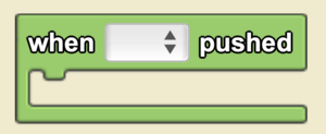
Executes commands inside this block (once, from top to bottom) when the push button widget is pushed. Widgets can be created using the Edit Widgets feature.
when [▼] pushed is a code block from the Interface drawer.
Usage
when [▼] pushed begins a single execution of a stack of code (from top to bottom) when the pushed button widget is pushed. Widgets can be created using the Edit Widgets feature.
Note: It is useful to use the ‘when pushed’ with a push button widget when you want to execute a code segment once.
Syntax
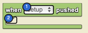
Input:
- Select the desired push-button widget from the drop down menu.
Example
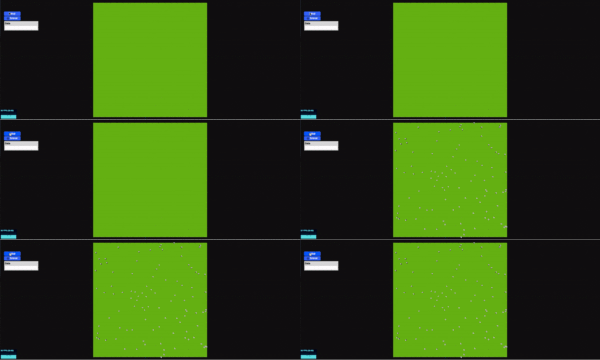
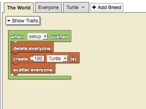
By default, StarLogo Nova displays the the setup button widget. More buttons can be added by pressing ‘edit interface.’ After new push buttons are created, they will be displayed in the dropdown menu in the when pushed button. This button executes the instructions within the code when the button is pressed. In this case, we see common setup behavior.


